Rob Galbraith

A design professional and leader with 25 years experience.

HSBC Global Banking Home

2018 → 2019

HSBC re-designed Home screens displayed across multiple devices
HSBC logo

The project

HSBC required a new global Home/Accounts experience to introduce improvements in speed, responsivity and to address perceived customer experience shortcomings within the business.

Background to my role within HSBC

I was hired by the Banking and Servicing digital team as one of two Lead Product Designers. Together we built a design team to construct the framework of the new responsive system to deliver banking services to all HSBC customers worldwide.

Starting with an iterative approach, we fully utilised the monthly-cycle global user research sessions available, to help us focus clearly on the customer need.

Working with Digital Product Owners, Business Analysts, Developers and key market stakeholders we created a suite of journeys and experiences that have now been rolled out to over 20 countries.

Starting the project

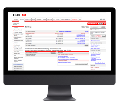
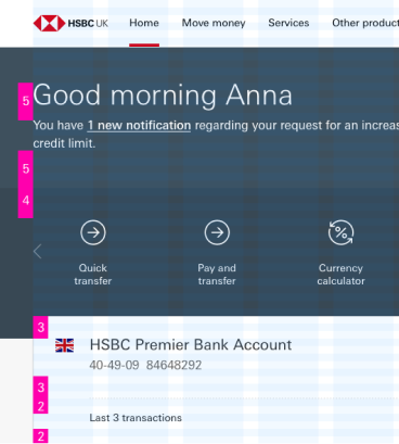
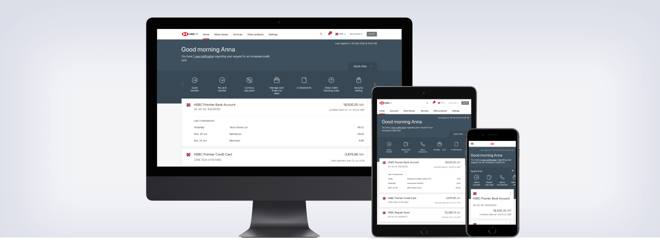
HSBC's global online banking experience in 2018 was in need of a refresh.

Due to the nature of the current agency-delivered design, the home screen for customers banking journey loads were unreasonably slow for such a high traffic page. From an experience point of view the site wasn't responsive and didn't work well unless it was viewed on a desktop sized screen.

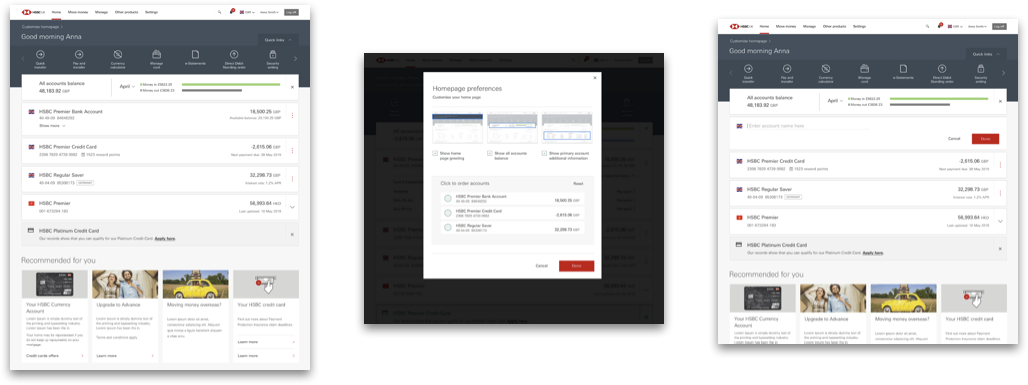
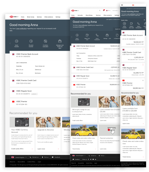
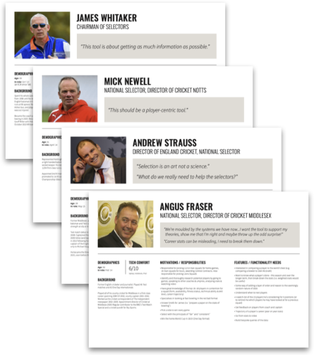
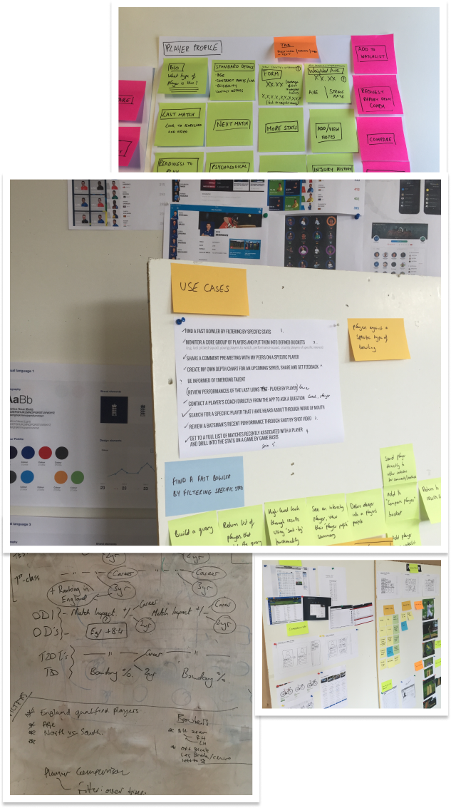
I ran internal stakeholder workshops to identify the main issues from the business side.

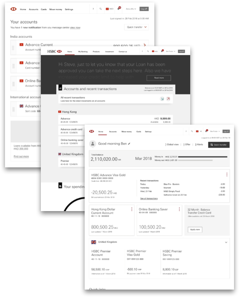
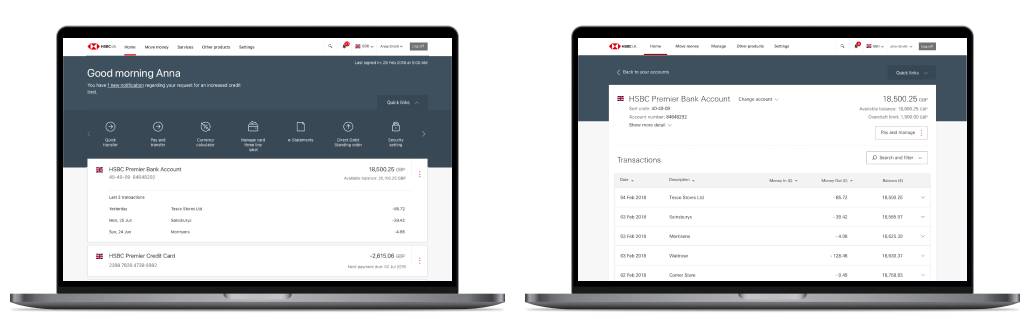
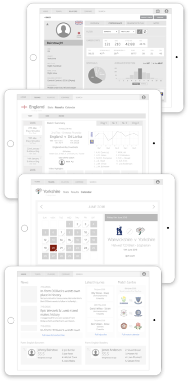
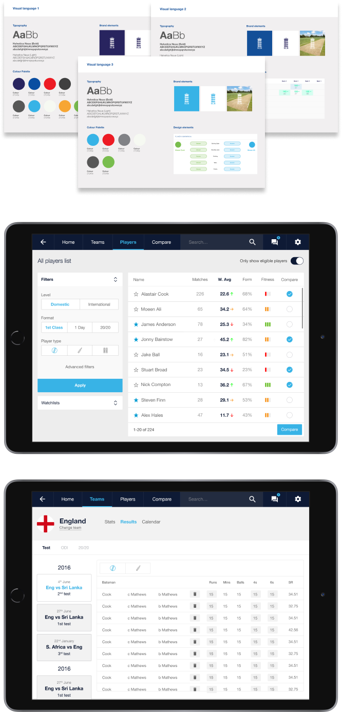
With this output I led a team of four designers to create alternatives that we could forward take into a customer research phase.

HSBC previous website showing on a desktop screen
Lo-fi screen design variants

The design brief

Based on the output of the workshops and discussions with stakeholders globally the high-level brief from the business was made up from the following:

  • Improved browser performance/response times
  • Intuitive design and navigation (including responsive view)
  • Easy access to accounts, balances and transactions
  • Ensure smooth entry to Move Money journeys
  • Accurate analytics and optimisation enabled
  • Reduced operational costs (e.g. CPU)

The team and I carried out research into core 'everyday banking' tasks to provide customers with easy access to the most common journeys undertaken.

We then undertook to create a series of designs to meet the brief and arranged a series of user testing sessions with customers in key markets to enable us to narrow our focus.


Customer research

Map showing location of user testing

Once we had narrowed down the teams ideas into lo-fi design prototypes we worked with our global testing partner to undertake qualitative testing of the proposals with customers in UK, India, USA, Canada & Hong Kong.

Initially we organised a card sorting exercise to rank the highest to lowest priority elements with the users. The results of this enabled us to give specific journeys a higher priority in some regions.

The testing and iteration of the design proceded over 3 months until we were confident that the design was fulfilling the brief from the business and was proven to work with customers across HSBC's biggest markets.

MVP feature

  • New global header & footer
  • Greeting
  • Account view - list
  • Quick transfer
  • Useful links - static
  • Notifications & Alerts
  • Products and offer messages

MVP+ feature

  • Quick links personalised/dynamic
  • Account view (tile)
  • Total balance - money in/out
  • Your Spending / Balance After Bills
  • Account rename (inline)
  • Account re-ordering

Splitting the page in two

Image showing the split of new page content

Early on we realised that to meet the business goal of speeding up the delivery of the home screen with every login to online banking, we may need to split the experience into Account Summary and Account Detail.

Whilst analysing typical customer behaviour globally, we found that the majority of visits were to see a summary of their accounts and then additionally to undertake another pre-planned everyday banking task, which could be to see more detail on an account. This was borne out by the user testing and card sorting exercises.

The Account Summary page could now act as a springboard to most of the popular journeys customers undertook via the Quick Links panel and the detail for each account could be accessed in one click too.

Customers across all regions tested actively preferred this setup due to simplifying the UI and signposting where they typically needed to get to.

Design delivery

As India was agreed to be the first loction we would start the roll-out to, I spent some time on location attending user testing and working with local developers in crafting an on-brand, user-focused, modern accessible release candidate.

The team utilised the SAFe agile framework for the project and I attended the Pi Planning sessions in India to ensure correct approach to delivering the designs globally.

With the design iterations complete and signed-off we looked to add to our existing pattern library of elements the developers could then look to re-use.

Image showing iconography as a sprite
Image showing the design modified to show development instruction

MVP+

Screen designs showing MVP plus features

Post launch

With a successful launch in India, we carried on testing with customers in new markets as well as receiving feedback from people using the live service.

New MVP+ features that rose to the top of the list were:

  • Rewards points
  • Account ordering
  • Account renaming
  • Account summary (money in/out and trends)
  • Quick links improvements
  • Secondary card holders
  • Spending categorisation and filtration
HSBC re-designed Home screens displayed across multiple breakpoints

Global rollout

The new Online Banking Accounts pages are launched and live for customers in over 20 markets. Just released in US & Canada. The UK launch is due in 2023.

https://www.hsbc.co.uk/ways-to-bank/online-banking/updates/

Following the successful rollout of the new Accounts pages, i led the team on the same process for the payments and account servicing journeys. The goal, to ensure all the Online Banking journeys align to create a cohesive and user-focused experience for HSBC's millions of customers.

ECB Player Selection app

2016

ECB app screens displayed across multiple tablets
English Cricket Board logo

The project

The England and Wales Cricket Board wanted to create a functional proof-of-concept, tablet-based application to bring together the vast data they hold on players to aid in evidence-based team selection.

My role and approach

In my role as Lead Product Designer I worked with a UI Designer and Project Manager to facilitate Stakeholder interviews with the ECB board, the data team and existing development teams to fully understand the user need and how to best deliver on it to timescale and budget.

From the conclusion of this research I constructed precise personas, defined the Information Architecture, created key user journeys and ran a workshop with key stakeholders to agree the approach and project boundaries.

I worked with the UI designer to undertake competitor analysis and industry best practise with a specific bias toward data visualisation.

With the key design elements completed and presented to the ECB board, we refined, delivered and supported the transition to development.

User research

The project team met up with all the 4 key stakeholders (National Team Selectors) to interview them about what functionality they needed from the tool, what data was especially important and how they would use it in specific scenarios.

As the user base for the application was unusually low, we were able to finely tune the approach required. It was also an opportunity to gauge how comfortable each user was with digital interfaces in general as the usability of presenting query-able complex data was paramount to its success as a tool.

Selector profile and preference cards
Collage of imagery showing notes taken during ECB research phase

Defining the proposition

With the understanding of the processes and key use cases of each selector now recorded and understood, I started creating the information architecture of the application.

The workflow of each selector was subtly different, depending on their responsibility and the key data each was looking to uncover and to share.

Especially important was the ability to compare data on players across a wide variety of metrics, but also being able to cross-reference against upcoming opponents data to look at where a particular player could have a specific edge.

While the findability of data was critical, also vital was the ability to share and communicate with other selectors and county fitness coaches up and down the country, so a messaging system was included to allow for real-time decisions to be made.


Lo-fi designs

With the general structure of the application created I then created lo-fi designs of how each section would present the key data. I met up again with the data team to ensure the output of the API's (data and match video) lined up with the demands of the application.

Key sections created were:

Home

Up to date news and high-level form and fitness.

Teams

Where results and performance key metrics across all match formats could be accessed.

Players

Full career and form player statistics and accompanying video can be easily accessed and compared together with a notes area embedded in the apps messaging system to keep all selectors in the decisioning loop.

Image showing examples of ECB project lo-fi designs
Image depicting handover assets to ECB

Delivery

I created a high level prototype of the initial flow and presented back to the stakeholder group to refine.

Once we agreed on the proposition we applied styling based on brand guidelines and industry shorthand to ensure seamless understanding of what the UI was trying to communicate and to minimise initial learning of the tool.

With all the Selectors comfortable with the look and feel of their application we achieved sign-off and delivered all the work to their internal development team to start on the build.

The Director of English Cricket and instigator of the decision to be more data-driven, Sir Andrew Strauss, told me that we had achieved what he had envisioned when starting out and that it would become the critical tool to allow the Selectors to be more confident about putting out the correct team in all situations.

Money Supermarket app

2014

Money Supermarket app screens shown on 2 phones
Money Supermarket logo

The project

Money Supermarket wanted to create an application to help their customers save money and keep track of their progress towards achieving their financial savings goals.

My role and approach

Moneysupermarket engaged EPAM to create the application and In my role as UX Director I was charged with creating a product that fulfilled both the client's goals but would also be a seamless experience.

Within Moneysupermarket the evangelist for the product concept was the newly hired CIO. I ran a two day requirements gathering workshop with him and the project team at the US offices of our newly acquired design agency, Empathy Labs, in Philadelphia.

I then worked onsite at Moneysupermarket's head office with development team to agree technical feasability before engaging the UX and UI designers in the US office to produce iterations until we achieved the client's vision.

The vision

The client for this project had a clear vision of what they wanted in terms of functionality.

After the requirements gathering workshop in the US, I spent a week onsite with the CIO and his technical team to create the skeleton framework of the application and its core feature-set.

The core features agreed upon were:

  • First time onboarding and personalisation
  • Personalised dashboard home screen
  • Integration with existing Money Supermarket user accounts
  • A suite of local price checking tools
  • Personalised savings targets
  • News and deals
Image showing high level page designs on 'post-its'
Image showing project wireframes

The detail

Once we had agreed the scope and high level detail with the client I then worked with a Senior and Junior UX Designer in the US office to capture the detailed flows for both new and returning users.

We conducted some guerilla research for some key areas (onboarding and goal setting) to ensure any unwarranted complexity was removed.

Throughout this process of capturing all interactions we had regular scheduled check-ins with the clients project team to ensure we could technically produce the functionality we were designing into the application.


The dashboard

Central to the idea of the application was an evolving and personalised home screen that encouraged both existing and prospective customers to see how much they could save on products and services.

The client was keen to gamifiy some elements to reward users and ultimately retain usage.

The dashboard went through a few iterations until the client was satisfied with the data hierarchy and detail presented.

Once all the wireframes were for each section was completed, my team worked with the UI designers to implement a visual language for the app.

Dashboard screen wireframes
Final delivery screens

Delivery

Money Supermarket were in the middle of a re-branding exercise at this time, which introduced some complexities to the delivery schedule.

I liaised with the branding agency and our UI Design team to ensure adherence to the core brand values and general styling guidelines.

The project was delivered to Money Supermarket's development team, on time and to budget.

Curriculum Vitae

2023 → 1997

Work history timeline

  • 2023
  • 2022
  • 2021
  • 2020
  • 2019
  • 2018
  • 2017
  • 2016
  • 2015
  • 2014
  • 2013
  • 2012
  • 2011
  • 2010
  • 2009
  • 2008
  • 2007
  • 2006
  • 2005
  • 2004
  • 2003
  • 2002
  • 2001
  • 2000
  • 1999
  • 1998
  • 1997
HSBC Logo

HSBC Bank

Digital Product & UX Manager (Contract)

EPAM logo

EPAM

UX Director (Permanent)

Virgin Media logo

Virgin Media

Lead UX Designer (Permanent)

Aquent logo

Aquent

Senior Web Designer (Contract)

Aquent logo

Adgistics

Senior Web Designer (Permanent)

Gameplay.com logo

gameplay.com

Senior Web Designer (Permanent)

House of Commons logo

House of Commons

Web Designer (Permanent)

2016 → 2023

HSBC Logo

HSBC Bank

Digital Product & UX Manager (Contract)

In 2016, I was hired as a Lead Product Designer working within the Global Digital team.

I initially worked within the Banking and Servicing team whose remit was all customer digital journeys post-login. As part of this team, between 2016 and 2019, I worked alongside another Lead Product Designer to re-design all Accounts servicing and Payment journeys with our team of 7.

In 2018, I led the re-design of the Global Home/Accounts experience. The project achieved all of its pre-defined business goals and is now rolled out to all HSBC markets.

In 2019, I conducted a research project examining how the Move Money (payment journeys) could be improved from the ground up.

In 2020 I joined the Wealth team on journeys for HNW clients.

From 2021 to 2023 I moved back to the Servicing side to lead and produce updated journeys within the HSBC Mobile Banking app across many countries.

2014 → 2016

Epam logo

EPAM

UX Director (Permanent)

In 2014, I was hired as UX Director to establish a centralised design function within this highly successful Software Engineering company.

Working with the Global Head of Design, we created a local design team to support sales and pitch work from the London offices. To support the company vision of selling a bundled design and dev solution, however, we needed to expand rapidly which was ultimately achieved through acquisition.

Empathy Labs, a US-based Digital Strategy and Experience Design Agency who had been a partner for a year or two, became more integrated. In 2014, Great Fridays, who were a successful UK-based Design Agency were puchased.

I led the UX team from the London office. Additionally to my management role, I also undertook client UX work and engagements for the EPAM's most important client relationships, running local workshops (in Europe and United States) and presenting design pitches.

Clients included: Google, Royal Bank of Scotland, UBS, Coca-cola, McLaren/AstraZeneca, Money Supermarket, Kantar, Amway, Datalex, ECB + many more

Epam logo Epam client logos

2007 → 2013

Virgin Media Logo

Virgin Media

Lead UX Designer (Permanent)

My role at Virgin Media was to lead the digital UX design team. Our responsibility included all of Virgin Media's IA & UX design function. Projects included:

Virgin TV Anywhere

A year long project into Virgin Media's first online full On Demand service. It allows users to use a companion mobile app to control their STB's and have access to live, VOD and catch-up web services. I led the team of designers and IA's through the full cycle, which utilised prototyping and rapid iteration.

London underground Wi-Fi app

My team dictated the IA direction and design of this widely used app. Best UX principles were applied at all stages.

Virgin Media web portal

My team conducted an extensive user research programme when we were tasked to re-align virginmedia.com, which is the Homepage and central internet resource for millions of Virgin Media customers. Upon completion our re-designed solutions were backed-up by extremely positive customer feedback, an uplift in dwell time and tailored advertising solutions.

Delivered full IA and design support for virginmediashorts.co.uk

Designed and directed a new blogging solution to be used site wide across virginmedia.com.

Wireframed and designed an online app store for VM's TiVo apps.

2004 → 2007

Aquent logo

Aquent

Senior Web Designer (Contract)

In 2004 I completed work for agencies/companies such as Ogilvy, ntl, Proximity London, Agency Republic, Fishburn Hedges & Edge Interactive amongst others and designed or produced sites (and/or ad campaigns) for royalmail.com, ntlworld.com, tesco.com, hotels.com, O2, Union Bank of Switzerland & propertymall.com.

Between 2005 and 2007 I worked exclusively for ntl, designing and coding microsites (Adobe suite & HTML/CSS) and digital advertising capaigns (Macromedia Flash).

Aquent client logos

2001 → 2003

Adgistics logo

Adgistics

Senior Web Designer (Permanent)

I co-ordinated a team of Senior & Junior designers whilst creating large, extensible, highly dynamic sites for some of the world's biggest companies.

Adgistics are a company that create bespoke digital solutions to enable global companies to streamline all of their advertising processes.

As the most senior member of the creative arm of the company, I was in charge of planning & managing all creative work across all sites from prototype design and meeting prospective clients (Vodafone, Sony, Disney, adidas etc), through to final build and testing. This post reported directly to the Head of Technology.

Adgistics client logos

2000 → 2001

Gameplay.com Logo

gameplay.com

Senior Web Designer (Permanent)

I joined gameplay.com as a Senior Web Designer during their first year of incorporation. Duties included UI design (Adobe suite/Macromedia Flash) and coding websites (HTML/CSS).

During my employment, I designed & created an intranet to support the rapidly growing workforce. The intranet had a standard information archive, but I also designed many new features and tools for it based on guerilla research I conducted with staff in all departments.

1997 → 2000

House of Commons Logo

House of Commons

Web Designer (Permanent)

I planned, designed, developed & implemented an Intranet to simplify the processes involved in all aspects of MP's Parliamentary finances and all administration of the House.

The Intranet was linked in with the Parliamentary Data and Video Network (PDVN) and had a 1700 person user-base (MP's etc). Delivered a full project life cycle from setting up IIS4 on NT boxes to maintaining the day-to-day running of the site.

Tools used Dreamweaver, Flash, and Photoshop. Languages used HTML, dHTML and JavaScript.

Software and tools

Figma logoFigma
Sketch logoSketch
Miro logoMiro
Adobe XD logoAdobe suite
InVision logoInVision
Omnigraffle logoOmnigraffle
Slack logoSlack
Zeplin logoZeplin
HTML 5 logoHTML 5
CSS 3 logoCSS 3
Jira logoJira
Confluence logoConfluence
Zoom logoZoom
Teams logoTeams

Bio

1972 → 2024

Education

1983-1988

Tunbridge Wells Grammar School For Boys

1988-1990

West Kent College

A levels in Graphic Design, History of Art and Photography

Hi, i'm Rob

I am a Lead Product Designer from Kent in England.

I live in the countryside with my wife, 2 dogs, 2 horses and 4 chickens.

Growing up as a teenager in the 1980's I became fascinated with all things technological. I learned computer programming when i was 13 and started designing and coding my own video games.

I have always loved drawing and visual design, so combined with my computer knowledge, it seemed a very natural progression to move from the Graphic Design i studied at college to moving my focus exclusively to Digital Design throughout my career.

I have spent my working life crafting experiences aimed at delighting the user.

Likes: Art & Design, Technology, Music, Science, Football, Photography, Animals and the Natural World.

Dislikes: Intolerance

Contact

2024

Let's connect!

Should you require my services I am available to be reached via email at:

Alternatively you can drop me a message on Linkedin. and i'll get right back to you.

Return to the top